We have been in love with The Prodigy’s latest album cover art since the day we laid our eyes on it. The red fox has already become such an icon and been a big talking point among fans. I’ve been lucky enough to interview the graphic designer behind this amazing design, Nick McFarlane.
Hello Nick, can you introduce yourself? Tell us a little about your background and where you’re from.
I’m a graphic designer, illustrator, artist, author mash up kind of guy. I’m a kiwi living in Auckland New Zealand right now, but spent 7 odd years in London which is where I started writing the book which eventually found its way into Liam Howlett’s hands.
What / who inspired you to get into graphic design? How long have you been in the business and how did you get into it?
The first graphic designer whose work I fell in love with was Jamie Reid who did the Sex Pistols album covers. Something about the brutal simplicity, DIY aesthetic and rebellious, subversive ideas just stopped me in my tracks and made me want to do what he did.
I studied Visual Communication at Uni. My first job was in branding, then in London I designed a magazine before chucking that in and freelancing in Ad agencies for about 5 years. I’ve been working for FCB AKL as Senior Designer for the last 5 years.
Is your graphic design all done via PC? What software do you use? Do you also use other types of methods?
Most of it is. Indesign, Photoshop and Illustrator are my main programmes. The other great tool every designer should get familiar with is old black and white photocopiers. You can get great textures out of them by reducing and enlarging your work.
Do you sketch your designs first before converting them to digital format?
When doing illustration or bespoke typography I’ll definitely get the pencils out. Drawing is all about ideas. Working on the Mac is all about executing them (quickly). I’ve always kept notebooks to collect my thoughts along the way too.
Up until your work with The Prodigy. What is your most enjoyable and successful work you have done? Tell us a little about this.
I spent 7 years working on an illustrated book called ‘Spinfluence. The Hardcore Propaganda Manual for Controlling the Masses.’ This is where I combined everything I love doing – thinking, dreaming, designing, drawing. I eventually managed to get it published and this is the book Liam stumbled across one fateful day. He loved it and as he said to me ‘something just clicked’ in his head.
So how did graphic designing for The Prodigy come about?
Liam had been out scouting for inspiration. He’d been just out and about sucking up as much noise and visual energy and ideas as possible for the upcoming album which was still a good year away. It’s just lucky for me that there were a couple of my books sitting in Ap-art Gallery London when Liam went in to check out a show. He picked up a book and was like “Yo what the fok is this?”. He tracked down my email and the rest as they say is history.
For inspiration and direction for the design. Did you get to listen to the new album or where you given an idea?
I didn’t ask to hear any. I just assumed that was a no no as you always hear about music that gets leaked so I didn’t want to put Liam on the spot asking to hear any. But I did ask about track names as that for me provides a better insight as to where an album’s heading. ( I knew it would be sonically epic).
How long did the process take and how many designs did you create? How much of your own ideas went into the design?
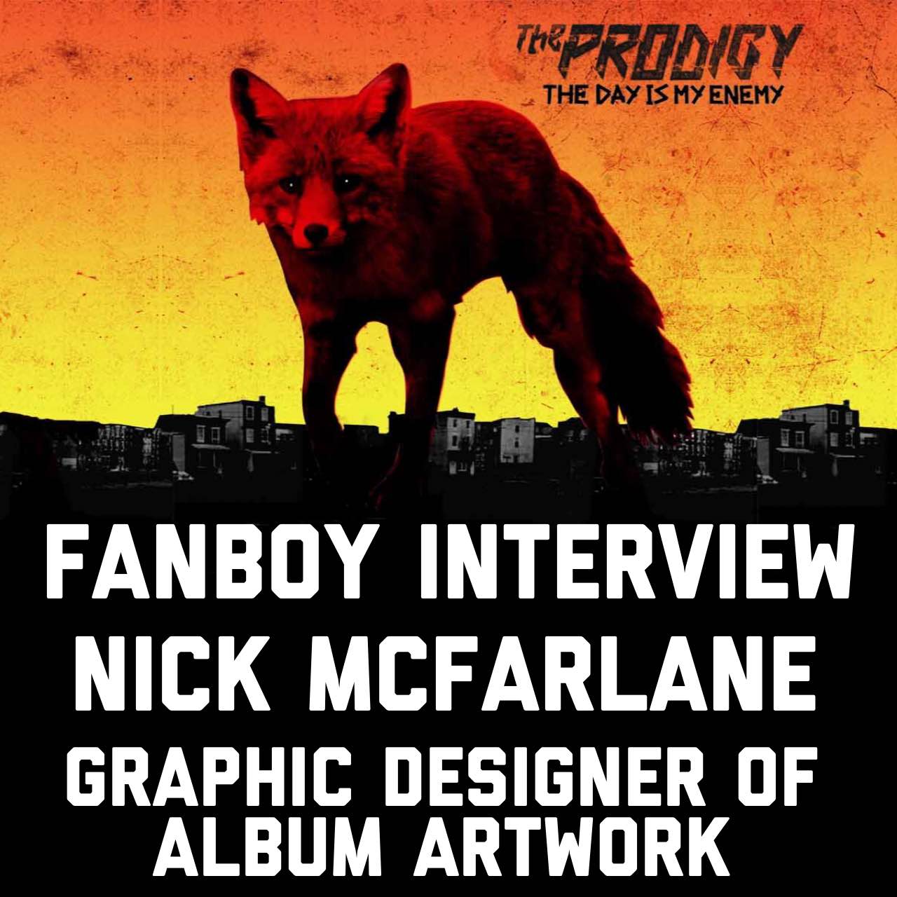
It was one hell of a crazy process. Liam is a perfectionist and I respect that. It took about 6 months and I sent him at last count 166 different ideas. Then there were iterations on top of that! It was Liam’s idea to use a fox as the emblem for the album. He’d kept on seeing one every time he left the studio in the early hours. And he mentioned how they only come out at night so they’re rebels just like The Prodigy. It was such a great idea. I then worked up as many possible fox ideas as I could think of. Head shots, body shots. Graphic, photographic, symbolic, literal, you name it I tried it. There were some cool ones involving fire as well.
We eventually whittled it down to the top 3. Then an interesting thing happened. Liam took a photo of the image on his computer screen. The way the camera captured the pixels, it turned the sky from flat orange into the orange-yellow gradient that it now is.
And that was the final master stroke which completely elevated the image. That colouring of the sky is so distinctive and took it to the next level.
Were you happy with the final design the band decided to go with? Did you have any personal favourites?
I love it. It’s everything I hoped I might’ve achieved before I begun. It’s graphically strong yet incredibly simple. It’s ominous without trying to be scary or anything. It’s a photograph yet is also a piece of graphic design. From the 166 ideas I sent Liam it’s proven itself to be the strongest, so its also my personal favourite!
For those who want to follow your footsteps in graphic design, what advice do you have for them?
The best graphic designers are those who consider it to be an art form and therefore put the same passion and intensity into their work as which an artist would put into his or her canvas.
Nick’s next project is a book called Hunting the Killer Idea which is about creativity and the various processes behind it. You can follow his progress as he regularly updates his how its going here:
http://huntingthekilleridea.tumblr.com
http://nickmcfarlane.co.nz
http://spinfluence.co.nz
https://twitter.com/SpinfluenceWolf
https://www.facebook.com/huntingthekilleridea
https://instagram.com/nickmcfarlane1